Creating and Designing Forms
Table of Contents
Creating a Form
Steps to Create a Form:
Click the Create form button in the upper right corner of the “Forms” tab.
Enter the form's name in the textbox within the Form Design mode. Click Publish. Typically, the name indicates the type of information included in the form or the phase it’s used for.
After publishing, the name of the new form will appear at the bottom of the list under the “Forms” tab.
Duplicate an existing form by clicking on the duplicate icon next to the form you wish to copy. This allows you to quickly create a new form based on an existing template.
Designing the Form
Designing the form involves placing different types of components on a grid of 12 horizontal columns and unlimited rows. There are four categories of components that can be placed in these positions, allowing for discrete sizing adjustments.
Components Overview
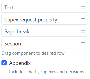
The components can be found in the tab on the right side of the screen when editing a form. Components include text boxes, request properties, image properties, table properties, page breaks, and sections.
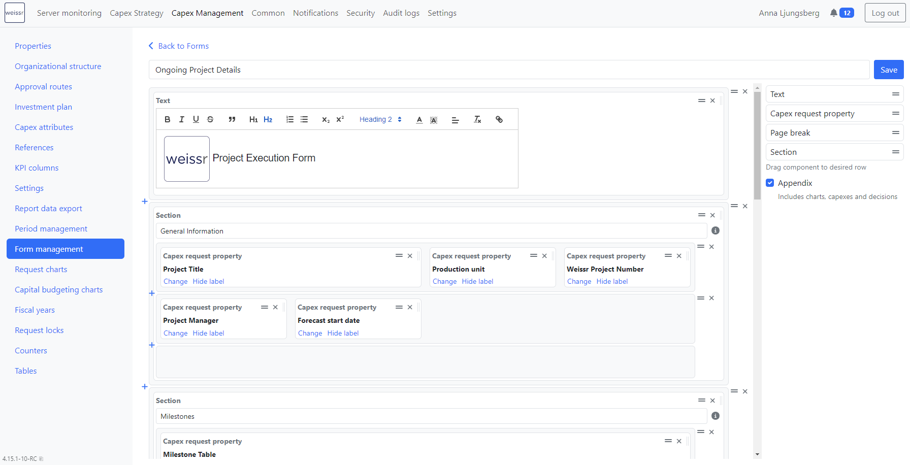
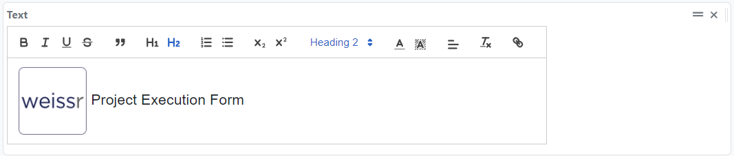
Text Boxes
Description:
A free-standing rich text component that can be placed anywhere on the form using drag & drop.
Used typically for labeling the form or giving instructions to users.
Editing:
Enter text directly in the textbox and format it using the toolbox at the top of the component.
The toolbox offers various formatting options, such as font size, color, bold, italic, and more.
Adjustment:
Can be easily moved, removed, and resized horizontally using the icons in the upper right corner of the component.
Allows for flexible positioning and customization within the form layout.
Images:
You can paste images into a text box component, enhancing the visual and informational content of your form.
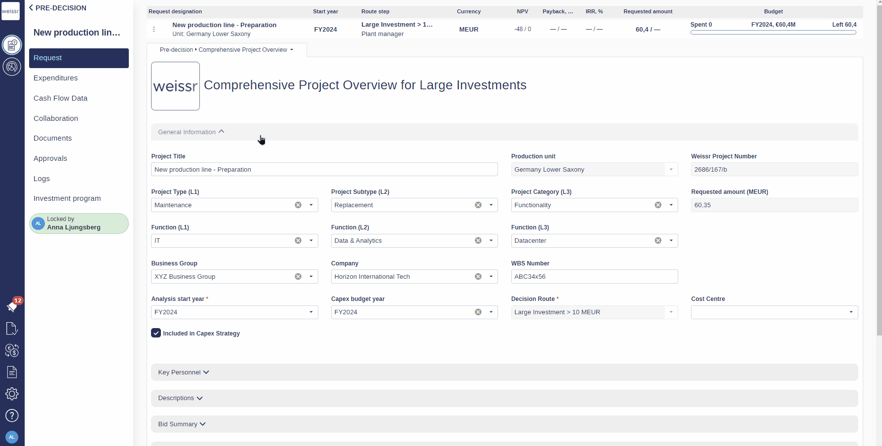
Request Properties
Description: The most common component in forms. Add by dragging the “Request property” component to the desired position.
Selection: Once dropped, select the property from the list. The form closes automatically and the property is placed.
Editing: The icons in the upper right corner allow you to move, remove, and resize properties. Use the Change hyperlink to select another property. The Hide label hides the property name
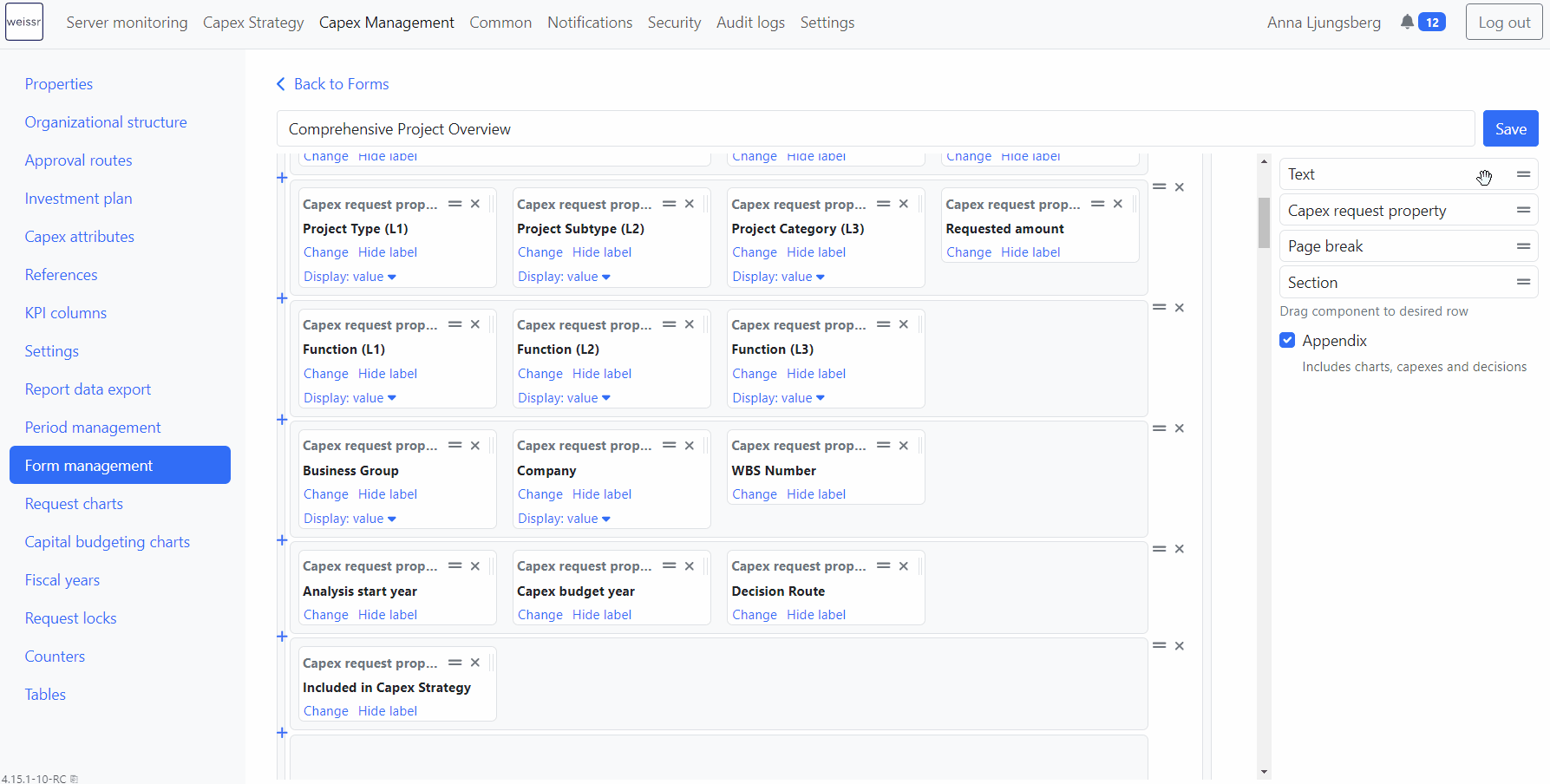
Image Properties
Description: Allows users to upload and view images directly in the form.
Storage: All previously uploaded images are kept within the property.
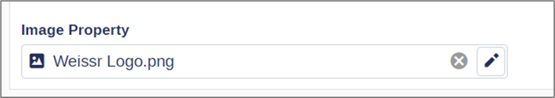
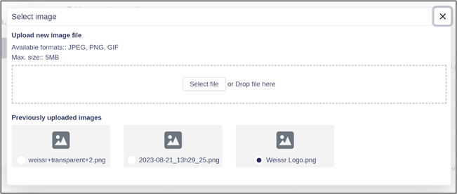
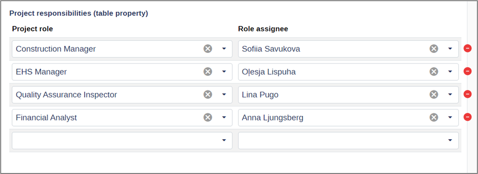
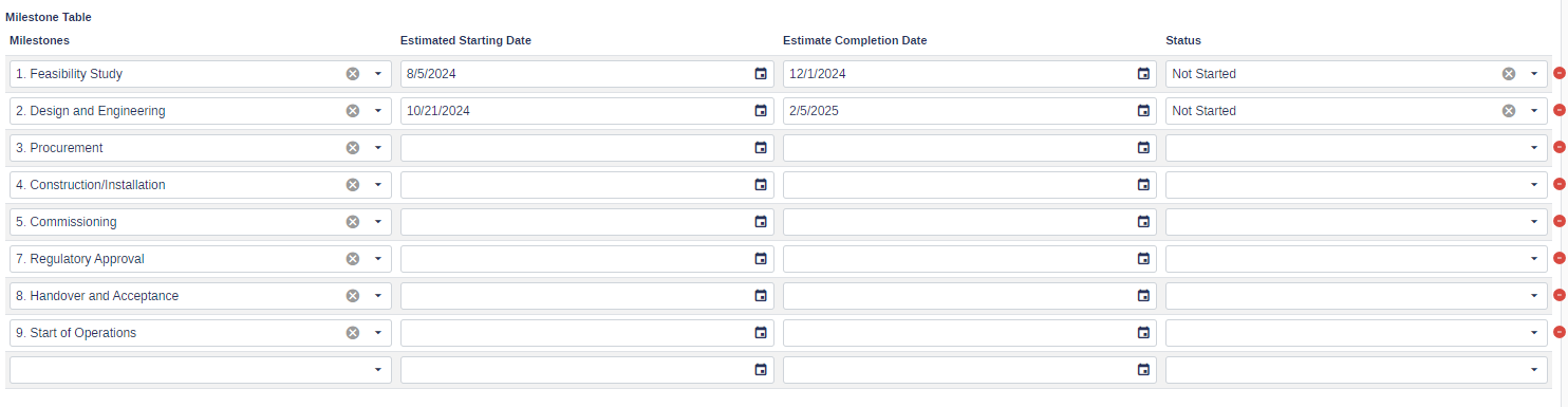
Table Properties
Description: It appears as a structured table, allowing users to input data across multiple rows, each accommodating various property types.
Page Breaks
Description: Used when designing printable reports to indicate where a forced page break is located.
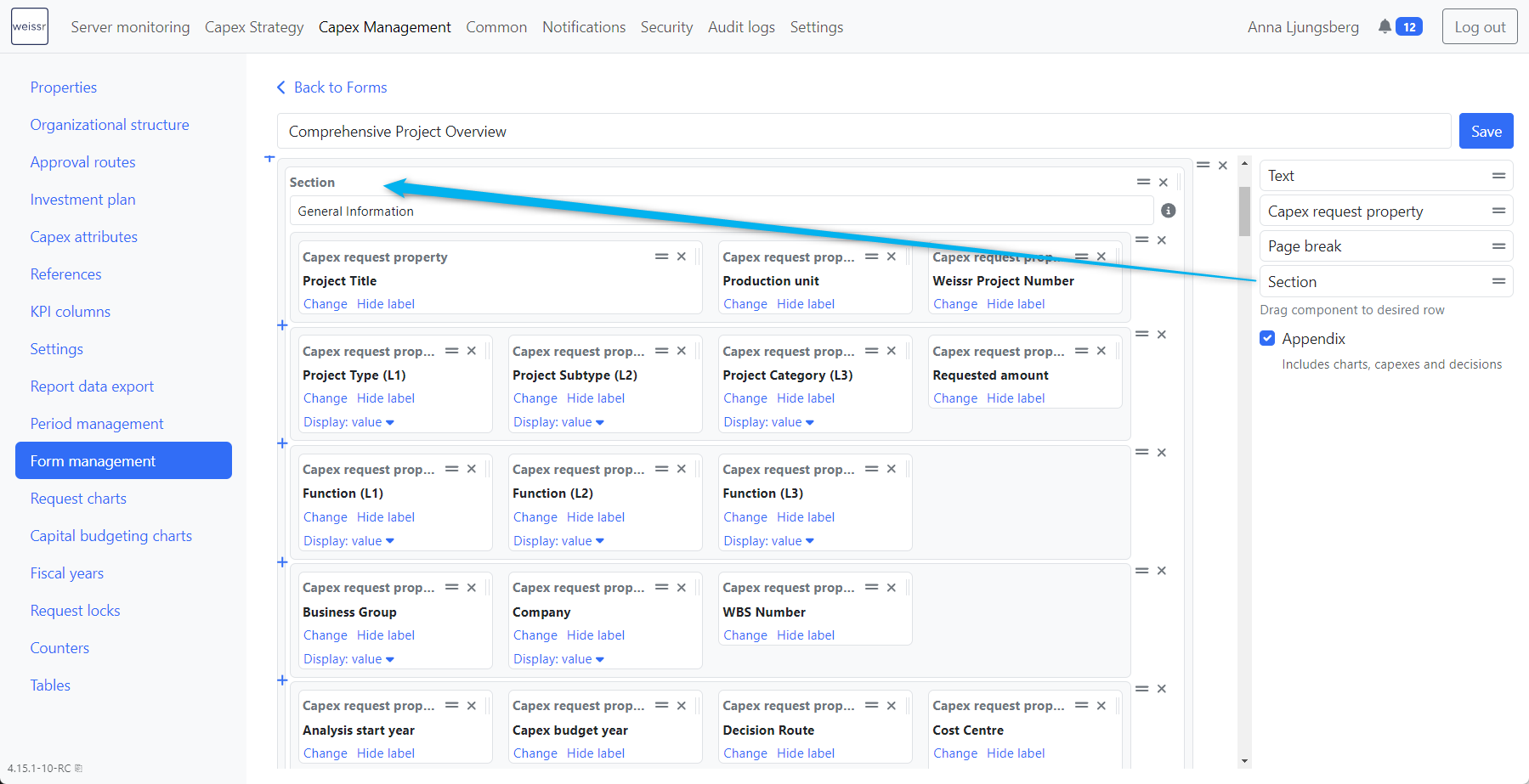
Sections
Description: Organize and structure data into collapsible and expandable areas within forms, reducing the need for extensive scrolling.
Addition: Drag and drop the section component to the desired location. Optionally, provide a section name. Sections with names allow you to collapse and expand within the form.
Editing: Sections can be labeled, moved, and resized. Collapsed sections will alert users with a red header if required properties are missing values.