Dashboard
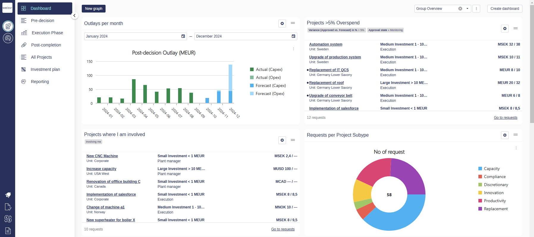
The Weissr Capex Management Dashboard is your central hub for monitoring and managing the investment process. It empowers you with real-time insights into key financial data, project statuses, and operational metrics. With its interactive and customizable features, the dashboard ensures you have everything you need to streamline workflows and make informed decisions.
From dynamic widgets to advanced filtering and visibility controls, the dashboard is designed to cater to diverse user needs—whether for personal analysis or team collaboration.
Key Features
Customizable Widgets
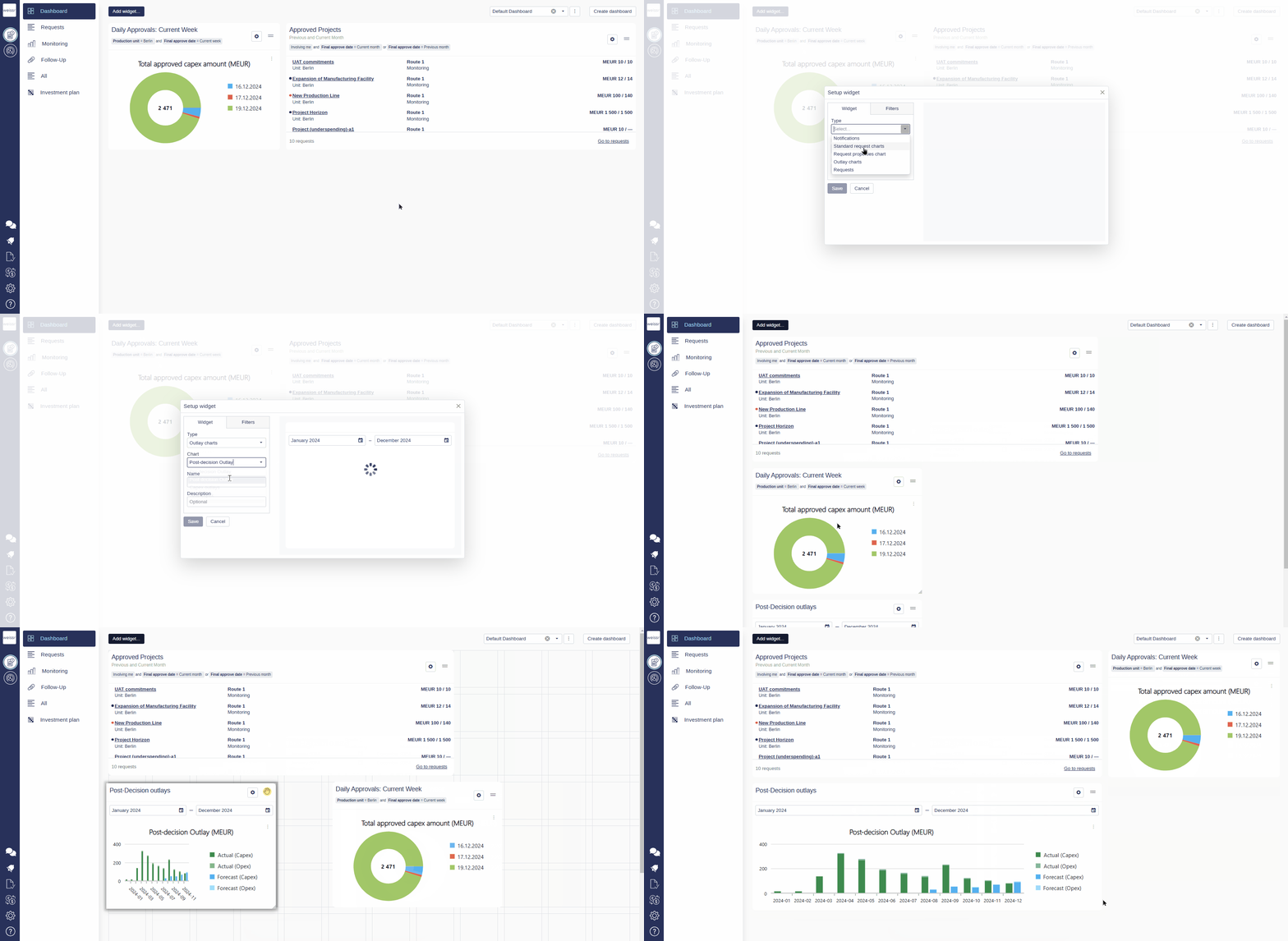
Add charts, tables, or other visualizations to display the data that matters most to you.
Widgets can be resized, rearranged, and configured to show specific data types using request filters.
Permission-Based Content
The dashboard content respects user node permissions, ensuring that users see only the data they are authorized to access.
Aggregated data is displayed in the currency selected in the user’s settings.
Private and Public Dashboards
Create and save unlimited dashboards, whether private for personal use or public for team collaboration.
Only users with superuser permissions can make a dashboard public.
Interactive Data Exploration
Users can customize and interact with widgets on public dashboards, enhancing data visualization and analysis. Customization options include:
Adding or modifying labels for better context.
Changing chart types (e.g., switching between bar, line, or donut charts) to suit your visualization preferences.
How to Create and Customize a Dashboard
Create a Dashboard
Access the Dashboard Tab
Navigate to the 'Dashboard' tab in the Weissr interface.Create a New Dashboard
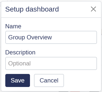
Click the 'Create Dashboard' button located in the top-right corner.Name Your Dashboard
Enter a clear and descriptive name to help you easily identify it later.Add a Description
Optionally, provide a brief description of the dashboard’s purpose or the type of data it will display.Save Your Dashboard
Click 'Save' to confirm the creation of your new, empty dashboard. Then, you can start adding and customizing widgets.
Duplicate a Dashboard
Access the Dashboard Tab
Navigate to the 'Dashboard' tab in the Weissr interface.Select a Dashboard to Duplicate
Locate the dashboard you want to duplicate from the list of available dashboards.Duplicate the Dashboard
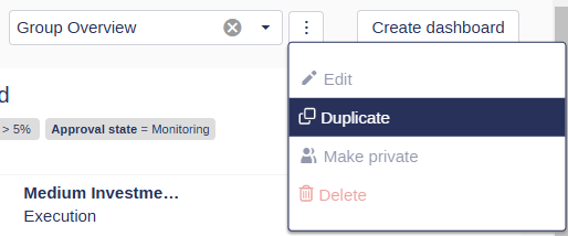
Click the context menu (three dots) next to the dashboard name and select 'Duplicate'. A new dashboard will be created with the default name "Copy of [original dashboard]".Edit the Duplicated Dashboard
After duplication, you will be redirected to the new dashboard. To rename it:Click the context menu (three dots) next to the dashboard name.
Select 'Edit' and enter a new name for the dashboard.
Save Changes
Confirm your edits to finalize the new dashboard.
Navigate Between Dashboards
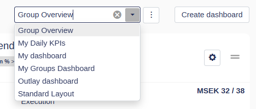
Use the dropdown menu in the top-right corner to switch between your saved dashboards.
Filtering Widgets
In Weissr, all widgets (except the Notification Widget) support filtering using the platform's standard filter logic. Filters enable targeted data representation, allowing you to refine and control the displayed information efficiently.
Steps to Apply a Filter
Open the widget options menu (gear icon).
Navigate to the 'Filters' tab.
Select a favorite filter or define a new filter condition.
Combine filters using operators (e.g., AND, OR).
Group conditions as needed for complex filtering logic.
Click 'Save' to apply the filter.
Key Filtering Details
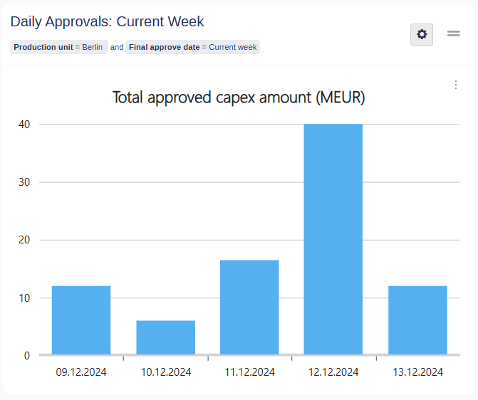
Filter Display: Applied filters are shown directly on the widget to clarify what data is being displayed.
Favorite Filters:
Always combined with other conditions using the AND operator.
Provide a consistent baseline for data filtering.
Operator Transparency: All applied conditions, including their operators, are visible for clarity.
To Remove a Filter
Open the widget options menu (gear icon).
Navigate to the 'Filters' tab.
Click the 'x' next to the applied filter to delete it
Click Save to confirm the changes.
Managing Dashboard Visibility: Private, Public, and System Default Dashboards (Superusers Only)
Superusers in Weissr Capex Management have advanced capabilities to manage dashboard visibility, enabling tailored access and standardized views across the organization. By default, dashboards created by standard users are private and accessible only to their creator. However, superusers can make dashboards public, allowing all users to access a consistent, predefined format for viewing data. Additionally, superusers can designate a system default dashboard, providing a unified, read-only view for all users.
These features help superusers:
Control who can view or share dashboards.
Streamline collaboration with public dashboards while maintaining oversight.
Ensure consistency by setting a system default dashboard as the organization’s standardized starting point.
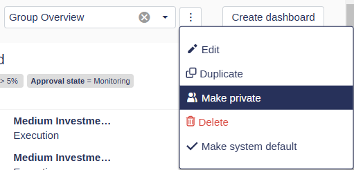
Make a Dashboard Private
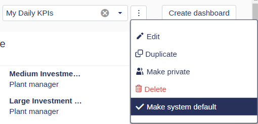
Click the context menu (three dots) next to the 'Create Dashboard' button.
Select 'Make Private' from the dropdown menu.
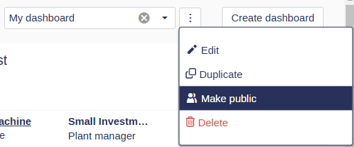
Make a Dashboard Public
Follow the same steps as for making a dashboard private:
Open the context menu (three dots) next to the 'Create Dashboard' button.
Select 'Make Public' from the dropdown menu.
Note: Only superusers can make dashboards public to ensure proper oversight and consistency in shared views.
This functionality gives you control over dashboard visibility, tailoring access to meet individual or organizational needs.
Make a Dashboard the System Default
Superusers have the option to designate a public dashboard as the System Default Dashboard, providing a standardized starting point for all users. This feature ensures consistency across the organization by defining a single, read-only dashboard that serves as the default view when users access the system.
Only public dashboards can be set as the system default, and there can only be one system default dashboard at a time.
Exporting Data
Click the context menu (three dots) on the desired widget.
Hover over 'Export' and select the desired file format (e.g., print, PNG, PDF, JPEG).
The widget data will be downloaded in your chosen format.
Interacting with Widgets
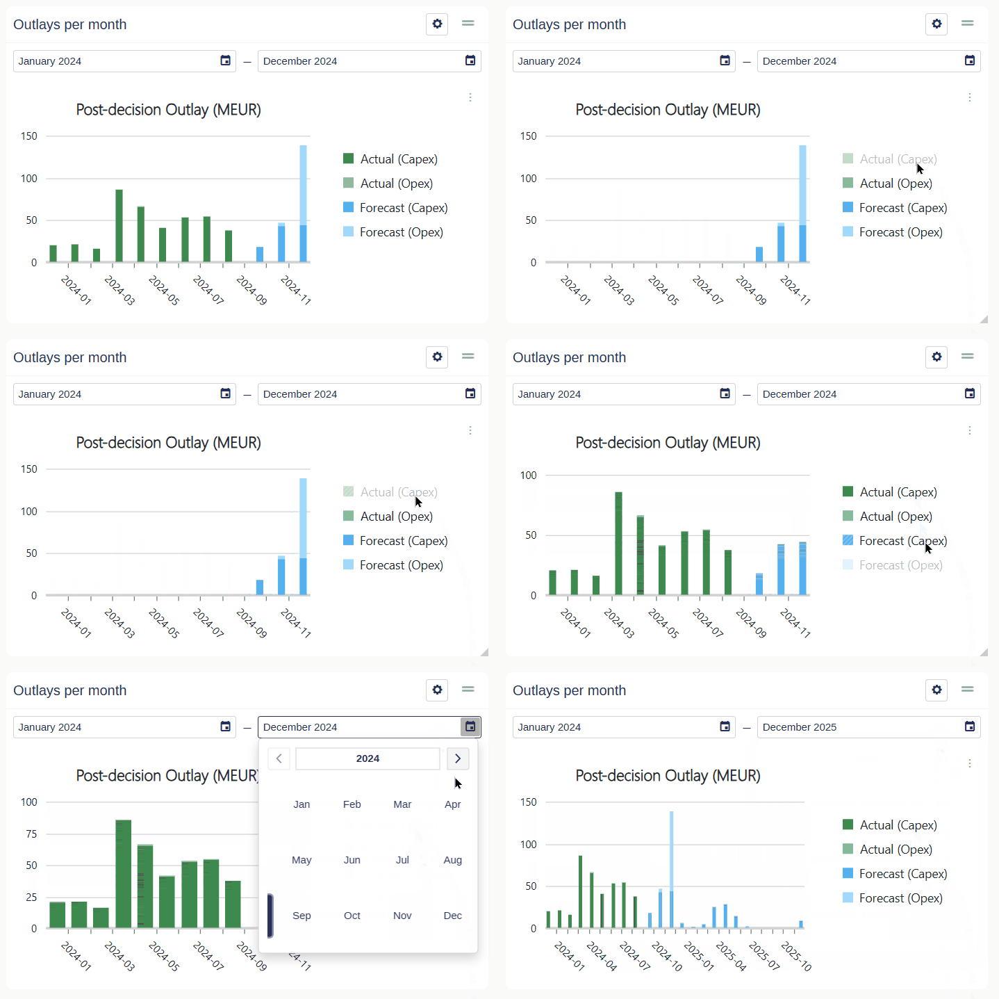
Widgets provide customization options, including interactive legends and adjustable date ranges, allowing you to refine your data view effortlessly. Here's how to make the most of these features:
Customizing Legends
Locate the Legend
Legends are typically displayed near the widget's bottom or side, showing the categories or data series in the chart.Toggle Data Series
Click on a legend item to hide or display the corresponding data series.
Use this feature to focus on specific datasets or simplify the chart view.
Highlight Data Categories
Hover over a legend item to emphasize its corresponding data in the chart.
This helps you quickly identify and analyze specific categories.
Dynamic Analysis
Enable or disable multiple legend items to customize your view.
All adjustments apply instantly, offering real-time insights.
Adjusting Date Ranges
Access Date Range Controls
Look for a date selector within the widget, usually located at the top or near the settings menu.Select a Date Range
Choose from predefined ranges (e.g., last week, last month).
Alternatively, set a custom date range to analyze data from specific periods.
Apply the Date Range
Once selected, the widget automatically updates to reflect the chosen timeframe.Combine Customizations
Use the date range selector alongside legend interactions for a more targeted analysis.
💡 Info: Adjustments to legends and date ranges are temporary, affecting only your current session unless saved in the widget’s configuration.
Widgets Types
Widgets in Weissr Capex Management allow users to visualize and interact with critical data. This section provides an overview of the available widget types, settings, and customization actions.
Request Properties Charts
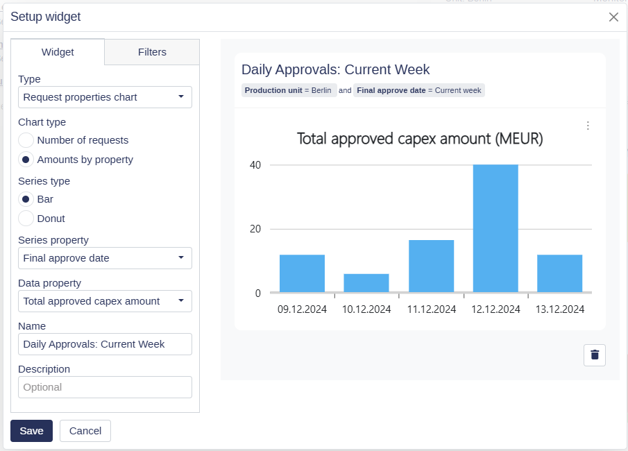
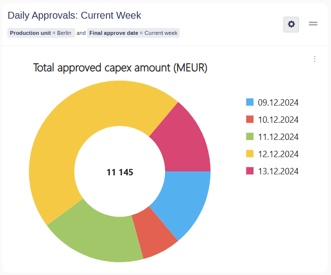
Request Properties Charts display request data as either bar charts or donut charts, providing flexibility in visualizing information. These charts can represent data by:
Settings for Request Properties Charts:
Chart Type: Select between Amounts by Property: Total amounts based on a specific property or Number of Requests: Count of requests.
Series Type: Select between Bar or Donut chart.
Series Property: The attribute used for categorization.
Data Property: The metric displayed (amount, count, etc.).
The preview in the widget settings shows how the chart will appear on the dashboard once configured.
Outlay Widgets
Pre-defined widgets for visualizing expenditure data include:
Pre-Decision Outlays: Planned monthly outlays for the specified period for projects under approval or as planned for approved projects.
Post-Decision Outlays: Actual and forecasted monthly outlays for approved projects.
Yearly Expenditures: Yearly view of pre- and post-decision outlays.
Total Expenditures: Summarized outlays across all years.
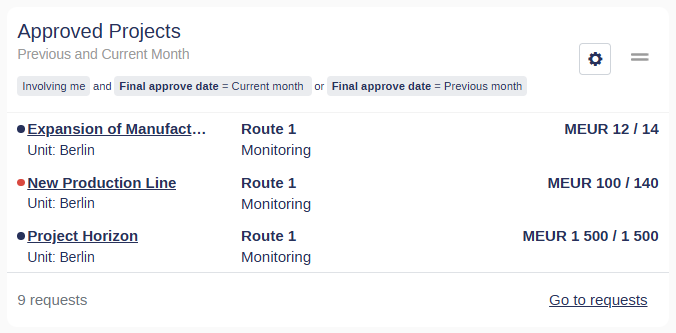
Request List Widget
Displays a list of requests, including Request name, Production unit, Approval route, Current Step, and Requested Amount.
Currently, a user cannot modify the information displayed in request list widgets.
Double-click any row to enter the request.
Notification Widget
The Notification Widget keeps you updated with real-time alerts, displaying a list of notifications specific to your user.
Standard Request Charts Widgets
Pre-defined widgets for visualizing Accumulated Discounted Cash Flow (ACDF) data include:
Accumulated Discounted Cash Flow, Pre-Decision: Yearly view of pre-decision ACDF.
Accumulated Discounted Cash Flow, Post-Decision: Yearly view of post-decision ACDF.
Accumulated Discounted Cash Flow (Combined): Yearly view of both pre- and post-decision ACDF.
