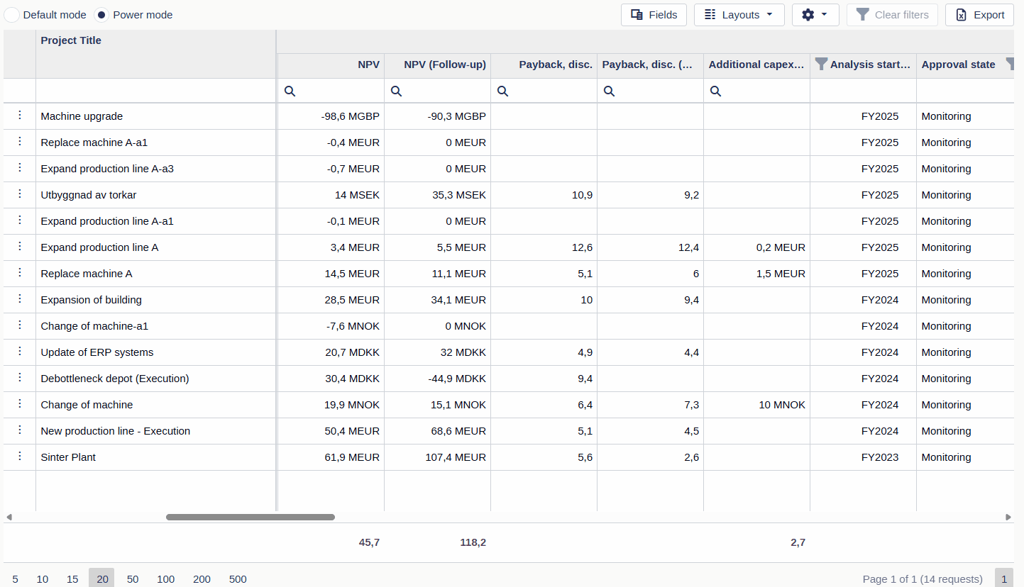
Power Mode
A custom view based on Power Mode provides an extended grid view of all requests and their associated properties. This grid is designed for users who want a comprehensive and detailed snapshot of their request data, enabling deep investment performance analysis.
💡 Power Mode is ideal for users who need to slice and dice data or manage a large volume of requests efficiently.
Power Mode views are accessed through custom views. Default filters, layout, and sorting are defined by a Superuser, while users can personalize the view for their own needs.
Built-in filtering and sorting in the grid
In addition to Weissr's standard filter and search panel, the grid itself offers powerful built-in filtering and sorting capabilities. These tools allow you to interact directly with the data, making it easier to focus on specific requests or categories with precision.
Column filtering options
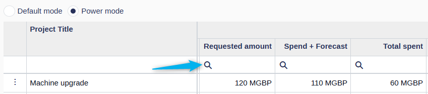
Filter row (below column headers)
Each column that supports text, numeric, or date filtering includes an input field just below the column header.
Text fields: Enter partial text to filter matching values
Numeric/date fields: Use range or exact values
Filters are applied in real time as you type
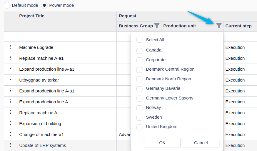
Header filters (dropdown fields)
For columns including dropdown values click the funnel icon in a column header to open a list of unique values.
Check or uncheck items to include/exclude them
Sorting options
You can organize your data with flexible built-in sorting:
Click-to-sort
Click a column header to sort it in ascending or descending order
Clicking a new column will remove the previous sort and apply sorting to the new column
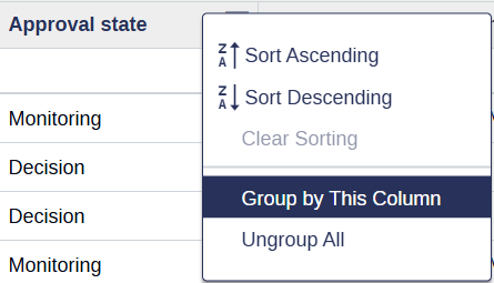
Right-click to sort (multi-column sorting)
Right-click a column header to choose Sort Ascending or Sort Descending
This method supports multi-level sorting—you can apply sorting to multiple columns at once
📌 Note: If a standard sorting rule (from the standard filter panel) is applied, sorting via column headers in the grid will be disabled.
Grouping data
Power Mode allows users to group requests by one or more property columns in the grid. This is a great way to organize and visually segment data based on shared values, such as business unit, cost center, or request status.
When a column is grouped:
The selected property becomes a group header row.
All requests with the same value for that property are displayed underneath that header.
💡 You can apply multiple groupings at once for a more structured view.
How to group requests
Follow these steps to group data in the power grid:
Right-click on a column header that supports grouping.
Select “Group by This Column” from the menu.
To add additional groupings, repeat the steps on another column.
How to ungroup
To remove groupings:
To ungroup a single column: Right-click the group row and select “Ungroup”.
To ungroup all: Right-click on any grouped group row or any column header and select “Ungroup All”.

Supported field types for grouping
Grouping in the Power Mode grid is supported for all common property types, including both system and dynamic fields.
However, the following field types are not supported for grouping:
Hyperlink
Image
Model
Rank
Table
⚠️ These field types are typically used for reference or visual display purposes, which is why grouping is not available.
Group summaries
When grouping is applied, Power Mode can display summary values for each group.
To enable summaries:
Turn on Show totals
Each group displays:
Number of requests
Aggregated values such as totals
Summary values:
Are aligned with their respective columns
Use currency formatting based on user settings
Are calculated across the full dataset, regardless of pagination
Summaries are only calculated when Show totals is enabled to maintain performance.
Editing request data in Power Mode
Power Mode streamlines editing by allowing direct, inline updates to request properties, with no need to open each request individually.
Editable fields are clearly marked:
A ✏️ pencil icon appears when you hover over most editable cells.
The cell background darkens slightly to indicate editability.
Click the cell to enter edit mode, or use the Tab key to move between editable fields.
Read-only fields may be restricted due to:
The field’s data type
The approval state where the field is editable (some fields lock post-approval as an example)
User role and permission settings
Editable cells are visually highlighted with a subtle overlay, making them easy to identify at a glance.
Editing time-based expenditure and cash flow data
Time-based data, such as investment model entries and expenditure forecasts, can only be edited using a form interface that supports the time dimension.
To edit these records:
Double-click the relevant row in the Power Mode grid in field or area locked for editing:
The request will open in a new window or tab, where you can enter or update time-phased expenditure and cash flow details in the dedicated menu item.
Clicking the Request Name opens the request directly from the grid.
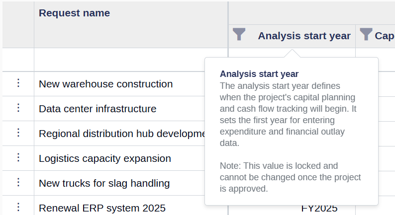
Tip: Hover over any column header in Power Mode to view a brief description of the field. This helps clarify the field’s purpose and expected input without interrupting your workflow.
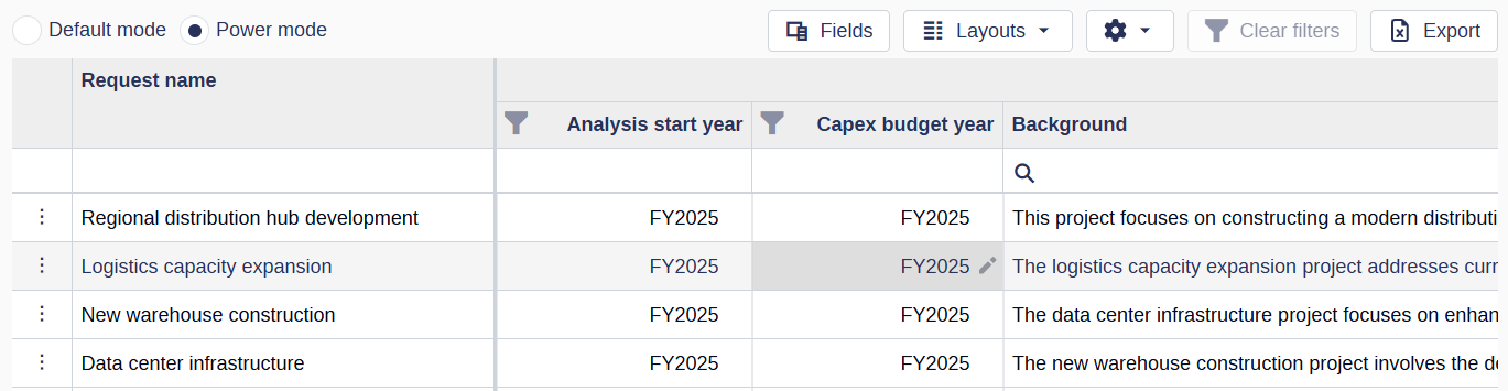
Flat grid structure
The Power Mode grid displays request data as individual columns.
Financial data is shown as separate columns per year and phase.
Examples:
Pre-decision FY2025
Decision FY2025
Post-decision FY2025
This flat structure allows columns to be reordered, fixed, and customized more easily.
Fields
The Fields button in Power Mode gives you access to all request fields available in the application. You can choose which fields or entire sections to include or exclude based on your needs, allowing you to tailor your view for easier navigation and editing.
Fields are organized into:
Fields in this view
Available fields
Quick navigation to a specific field
To quickly navigate to a specific field in Power Mode:
Make sure the field is included in your view—either by selecting it from a saved layout or adding it via the Fields pop-up.
In the Fields menu, click the name of the field you want to find.
📍 The grid will automatically scroll, bringing the selected field into view on the left side of the screen.
🧭 Tip: This is especially helpful when working with wide layouts or when you need to jump directly to a field without manually scrolling through the grid.
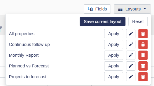
Layouts
Power Mode supports custom column layouts so users can personalize the grid to suit their needs. In layouts users can only define what request fields should be available. Layouts define the visible fields and their order in the grid.
Once a layout is saved and applied, the grid automatically updates to reflect the chosen configuration.
Users can:
Choose and reorder columns
Save layouts for private or public use.
A layout can only be made public by a superuser.
💡 Custom layouts are especially useful when many columns are available, allowing users to focus only on relevant data.
Power Mode settings
Power Mode includes two optional settings that enhance how data is displayed in the grid:
Word wrap enabled
When this setting is turned on:
Field data (excluding headers) will wrap across multiple lines, allowing you to view all content within a cell without scrolling horizontally.
💡 This is especially useful for fields with long text entries, such as descriptions or comments.
Show totals
When enabled:
All money-type properties (e.g., capex, opex) will display a grand total at the bottom of the grid.
Enables group summaries when grouping is applied.
⚠️ Warning: Enabling totals may impact performance, especially when many requests are loaded in the grid. Totals are calculated in real-time, so use this feature selectively when working with large datasets.

Column customization
Power Mode allows flexible column management.
Reorder columns
Drag and drop column headers to change order
Fix columns
You can pin columns to keep them visible:
Fix to left
Fix to right
Fixed columns remain visible when scrolling.
Column persistence
Column order and fixed state are saved per user and per view.
Currency display
All monetary values, including outlays, display a currency indicator.
Currency depends on user settings:
Local currency per request
Or user-selected currency
Exporting data
Users can export the Power Mode grid to Excel.
The export includes:
All visible columns
All filtered requests (across all pages)
Grouping structure
Group summaries and totals
The exported file reflects the structure and totals shown in the grid.
Summary values are exported as calculated values, not Excel formulas.