Expenditures (Capex & Opex)
The expenditure grid is where you specify the investments and their projected spending over time. You can enter expenditure data monthly, quarterly, or annually, allowing for flexible financial planning across your capex and opex items.
Below is a breakdown of how the grid works, how required fields are managed, and how you can personalize the layout for your workflow.
What is the expenditure grid?
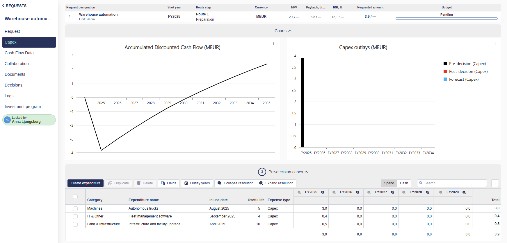
The expenditure grid is a table where each row represents an expenditure line item, and columns include data fields such as name, category, expense type (Capex/Opex), useful life, and outlay details. It provides both structure and flexibility to manage investment data throughout a project's lifecycle.
Editing expenditure data
The expenditure grid allows you to update values directly in the table, without opening each line item individually. This makes it fast and efficient to review and adjust multiple expenditures in one place.
How it works
A pencil icon appears when you hover over editable cells (except for outlay columns).
Editable fields have a slightly darker background, making them easy to identify at a glance.
Click a cell to enter edit mode, or press the Tab key to quickly move between fields.
📌 Editable cells are visually highlighted with a subtle overlay to help you spot them easily.
When fields are read-only
Some fields may not be editable due to:
The data type (e.g., system-generated or calculated values)
The approval state of the request (e.g., fields may lock after approval)
Your user role or permissions (certain fields may be restricted based on access level)
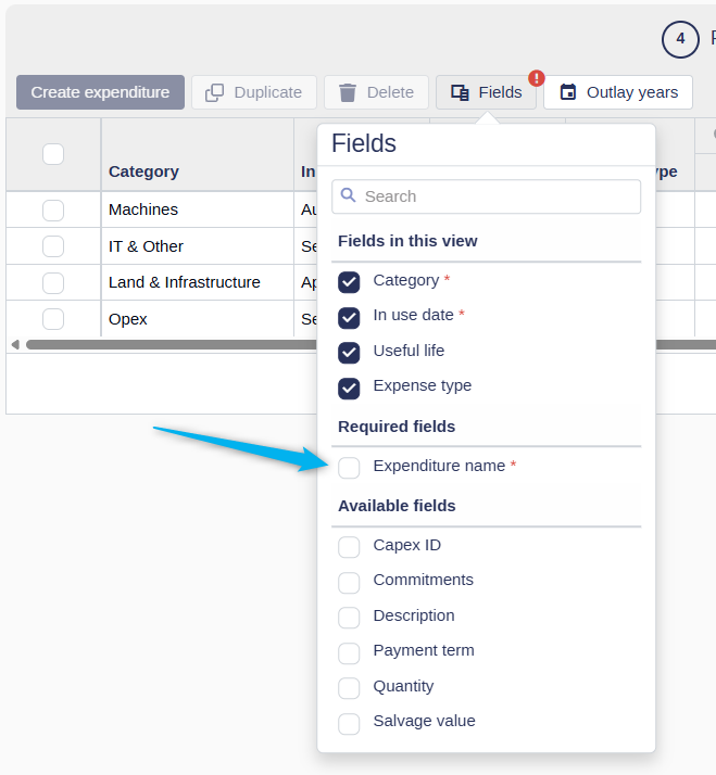
Required expenditure information
System-required fields
To create a new expenditure line item, Weissr requires the following fields:
Name
Category
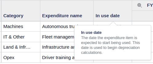
In use date
Expense type (Capex or Opex)
Useful life
These fields are essential for downstream functions like depreciation calculations, reporting, and integrations. Your administrator may prefill or hide some of these fields in the layout, but the values still apply in the background.
Organization-required fields
Your organization may also define custom required fields that must be filled when creating a new expenditure line. These are usually included in the default layout, but if you've modified your layout or excluded fields, the system will prompt you to add them before saving.
Depreciation details
For Capex expenditure items, Weissr automatically calculates depreciation to support financial planning and reporting. These calculations are based on values entered in the expenditure grid and apply only to line items marked as Capex.
Depreciation is based on the following fields:
Expense type set to Capex
Useful life (number of years the asset is depreciated)
In use date (when the asset starts being used)
Expenditure amount and outlay timing (how the cost is distributed over time)
Salvage value (optional) – if configured and provided, this value is deducted from the depreciable amount
📌 Note: If no salvage value is provided, the full cost of the asset will be depreciated over its useful life.
Weissr uses the straight-line depreciation method, distributing the depreciable amount evenly over the asset's useful life. The calculation frequency, either monthly or annually, is determined by your organization's administrator settings.
🔧 Configuration: Administrators can define the depreciation calculation in the system settings. For more information, refer to the depreciation settings documentation.
Expenditure outlays
You can enter projected expenditure amounts using different time resolutions:
Yearly
Quarterly
Monthly
Each expenditure line item is categorized as either Capex or Opex based on the Expense type field. These values contribute to the total requested, forecasted, and actual amounts depending on the phase of the project.
Understanding planned vs actual outlays
The expenditure grid tracks both planned and actual spending over time, based on the Forecast start date (id 41) defined for each project.
💡 Info:
Actual outlays include all expenditure amounts dated before the forecast start date.
Planned outlays are those occurring on or after the forecast start date.
The forecast start date serves as the cutoff between historical (actual) and future (planned) spend. This helps distinguish between confirmed financial activity and projections used for budgeting and forecasting.
In integrated environments, this date is typically set automatically when actuals are imported from an ERP system (via API or file imports).
In non-integrated environments, or when adjustments are needed, users with the appropriate permissions can manually update the forecast start date.
This distinction is key for understanding your project's financial trajectory and ensuring accurate reporting across different phases.
📌 Note: The forecast start date is not displayed in the expenditure grid itself. It is a property of the overall request and can be found in either:
The request form
The Power Mode view
⚠️ Warning: When a forecast start date is set, all outlay periods prior to that date become read-only.
For example, if the forecast start date is set to May 1, 2025:
The months January through April 2025 will be non-editable.
The entire Q2 2025 and full year 2025 columns will also be non-editable unless you expand to a monthly resolution.
To edit forecast values in partially locked time periods, you must expand the resolution to a level where editable periods are clearly separated (e.g., switch from quarterly or yearly to monthly view).
This behavior ensures that historical actuals remain locked and aligned with imported ERP data, while still allowing flexibility for forecasting future periods.
Managing the outlay view
The outlay section (time-based columns in the grid) supports flexible display options to match how detailed your financial planning needs to be.
Resolution settings are saved:
Per user
Per request
For one year
📌 Settings are saved based on the relative year position (e.g., 1st year, 2nd year), not specific calendar years (like 2024 or 2025).
If the request includes more years than your saved view, the system will display all available years automatically.
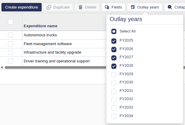
Selecting visible outlay years
You can control how many and which years appear in the outlay section:
Click the Outlay years button in the toolbar.
Select or deselect the years you want to display.
This helps you focus only on the relevant timeframe for your request.
📌 The available outlay years are determined by the analysis period length set for your project.
📌 Your selected outlay years are saved per user and apply per request.
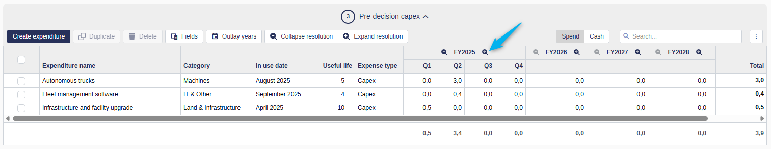
Changing resolution
You can control how detailed each year’s outlay data appears:
Click the magnifying glass icon on an individual year column to switch between monthly, quarterly, or yearly resolution.
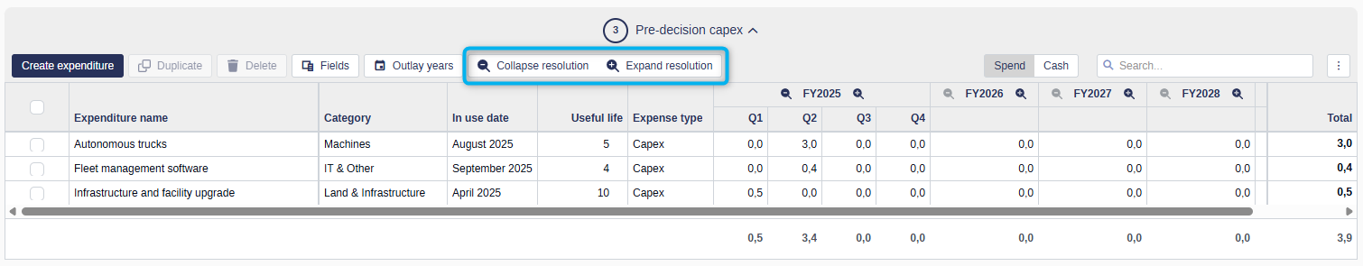
Use the Expand/Collapse resolution buttons in the toolbar to change the resolution for all years at once.
💡 Expanding to monthly resolution across many years may take a few moments to apply, especially in large requests.
Personalizing the expenditure grid
The grid is highly customizable to match how you work. Your settings are remembered across sessions and requests.
Setting fixed column positions
The expenditure grid allows you to fix the position of columns to improve navigation when working with wide datasets. This feature ensures key information stays visible while you scroll horizontally.
There are three fixed position settings:
Left – Pins the column to the far-left side of the grid. These columns remain visible when scrolling right.
Right – Pins the column to the far-right side of the grid. These columns remain visible when scrolling left.
Sticky – Keeps the column in place relative to your scroll position. Sticky columns remain visible as long as they are within the visible area of the grid but do not stay anchored like left- or right-fixed columns.
How to fix a column:
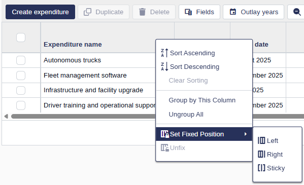
Right-click on the column header.
Select Set column position.
Choose Left, Right, or Sticky.
📌 You can fix multiple columns to the left, right, or sticky positions as needed to customize your view.
Fixed columns are especially useful for:
Keeping key identifiers (e.g., Expenditure name, Category) always visible
Locking totals or financial fields on the right side
Making large, complex grids easier to work with
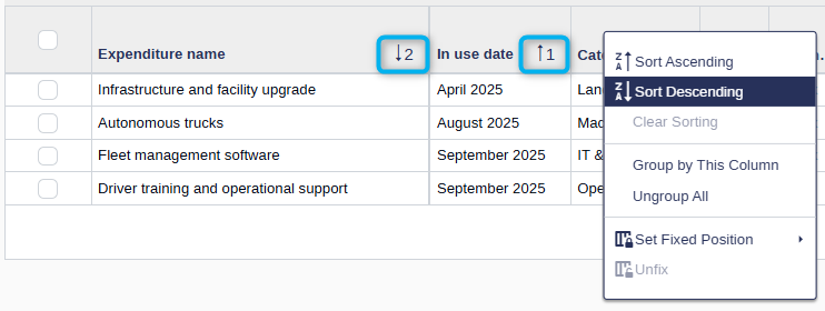
Sorting and search
Click on any column header to sort the grid in ascending or descending order.
To sort by multiple columns, right-click additional headers in your desired sort order. Each column will display a number indicating its position in the sort sequence.
Apply a free-text search to quickly find relevant expenditure items. Results are matched based on visible fields in your current layout.
📌 Sorting and search settings are saved per request and session. They reset when the session ends.
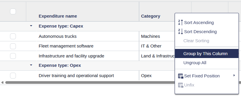
Grouping
Right-click on any column header and select Group by This Column to organize expenditure lines by shared values.
The grid will display grouped entries with subtotals for each group.
To remove grouping, right-click on the group row and select Ungroup or Ungroup All.
📌 Grouping is saved per request and helps you analyze totals or categories at a glance.
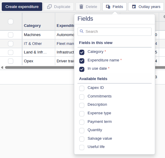
Column widths and field visibility
Resize columns by dragging the edge of any column header to adjust its width.
Show or hide fields by clicking the Fields button in the toolbar and selecting the columns you want to display.
Reorder columns by dragging and dropping column headers into your preferred position.
📌 Layout changes — including column width, visibility, and order — are saved per user and apply across all requests.
💡 Changes made in the pre-decision tab are automatically reflected in the post-decision tab for a consistent layout experience.
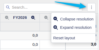
Screen resolution and layout controls
The number of visible buttons in the toolbar depends on your screen size and zoom level.
If space is limited, click the three-dot menu on the right side of the toolbar to access hidden actions.
This ensures full functionality, even on smaller screens or zoomed-in views.
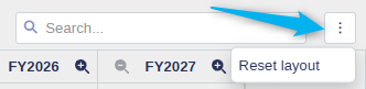
Reset to default
You can reset the expenditure grid layout to its default state at any time:
Click the three-dot menu in the toolbar.
Select Reset layout.
This action will clear your personalized settings, including:
Sorting
Grouping
Search filters
Column widths
Visible field selection
Outlay resolution settings
📌 The reset applies to both pre- and post-decision grids and reverts it to the default layout set by your administrator.
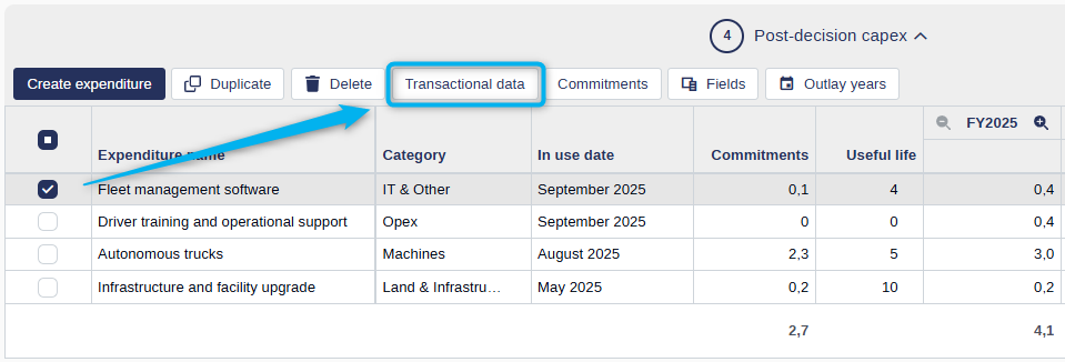
Action buttons in the expenditure grids
Each expenditure grid (Pre-decision and Post-decision) includes action buttons that help you manage and organize expenditure line items. These buttons are located in the grid toolbar.
General behavior
Some buttons are always available (e.g., Create expenditure, Fields, Outlay years, Expand/Collapse resolution).
Others are only enabled when one or more line items are selected (e.g., Duplicate, Delete).
Button availability and behavior of certain buttons may vary depending on your organization’s workflow configuration or integration setup.
For example, the Post-decision grid may include additional actions related to integration tasks or financial synchronization, depending on how your system is configured.
💡 Info: Button labels may be customized by your system administrator. The labels shown in your application might differ from those described in this documentation.
Deleting expenditures
An expenditure line item cannot be deleted while its External mapping ID (Property ID 68) is filled in. Rows with an External mapping ID are connected to an external system and may be receiving actuals through an integration, so they are protected from deletion to avoid breaking that connection.
To delete an expenditure that has an External mapping ID, first clear the External mapping ID, then delete the row.
Transactional data
For organizations using transactional data integration, the post-decision grid includes a Transactional data button that allows you to view detailed spend data per expenditure line item.
To access it, select one or more expenditure lines and click Transactional data in the toolbar. The button will only be enabled if at least one of the selected expenditure lines contains transactional data.
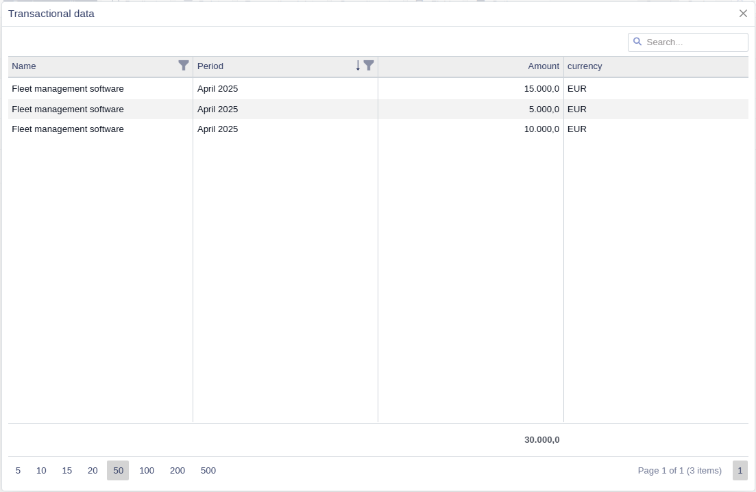
A pop-up window will appear showing period-level transaction details for each selected line item.
The transactional data grid displays all relevant information configured by your organization, such as:
Name
Financial period
Amount
Currency
Capex ID
PO number
GL account
Cost center
Other fields included in your data feed
This view helps you understand the actual costs contributing to the total spent amount for each period.
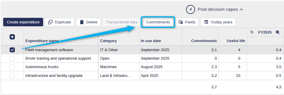
Commitments
If your organization’s transactional data integration includes commitments, a Commitments button will also be available in the post-decision grid, provided the Commitment property has been added as an available field in the expenditure layout by an administrator.
Select one or more expenditure lines and click Commitments. The button will only be enabled if at least one of the selected expenditure lines contains commitment data.
A pop-up window will show all underlying items contributing to the total commitment amount for the selected lines.
💡 Info: The commitments grid closely resembles the transactional data grid. The fields shown depend on your organization’s data feed configuration and may include custom fields relevant to your financial or procurement processes.
This feature gives visibility into pending or obligated spend, such as purchase orders or reserved funds, and supports more accurate tracking of project financials.