Charts
The Charts tab in Reports is where you view, compare and customise the charts generated from your financial model. Every chart is built from a report definition set up by your administrator, and you decide which alternatives and sites it compares, how the series look, and where the chart goes next: into a Presentations folder, or exported as an image.
Finding a chart
Charts live under each alternative, organised by the entity they belong to.
Go to Base Alternative, Strategic Building Block or Strategic Alternative and open the Reports tab, then select Charts.
Use the navigation tree on the left to browse to the entity the chart belongs to (Division > Site > Sub-industry > Category).
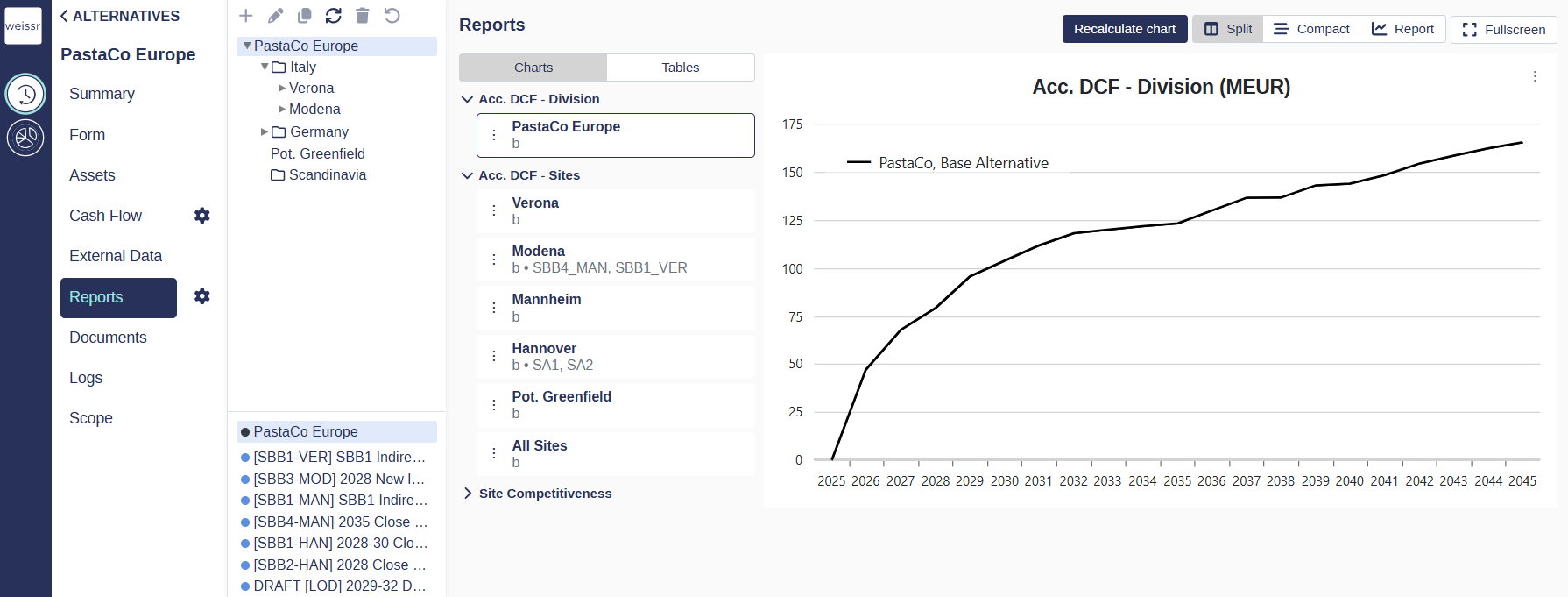
Click the chart in the left panel to open it in the right panel.
🔧 Configuration: All charts in Reports are generated from report definitions set up by your administrator. If you need a chart that follows other variables, contact your administrator. If you are an administrator you’ll find all you need here 👉 Configuring Reports
Switch between compact and split view
You can change how much room the chart list takes up next to the chart itself.
Go to Reports > Charts.
Click Compact or Split in the top right corner, above the chart grid.
Opening the edit dialog
All chart configuration happens in one dialog, reached from the chart itself.
Open the chart so it appears in the right panel.
Click the three dots to the left of the chart report and select Edit, or press E on your keyboard.
The dialog opens with several tabs: General for display settings, Series for the appearance of individual curves, and Alternative comparison and Site comparison for choosing what the chart compares.
📌 Note: Changes are applied when you click Save on the General tab. Allow a few seconds for the chart to redraw.
Selecting alternatives and sites NEW UI IN 5.3.5
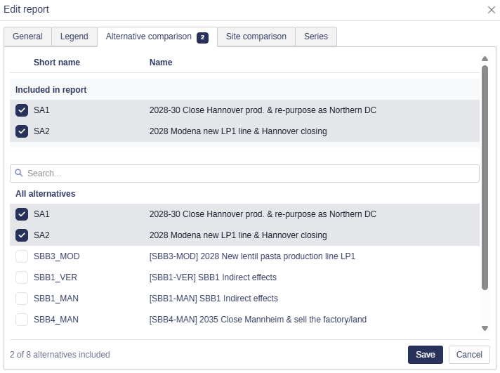
The Alternative comparison and Site comparison tabs control which alternatives and sites the chart compares. Both tabs use the same two-list layout, so you can see what is currently included without scrolling through everything else. The dialog is titled Edit chart or Edit report depending on what you are editing.
How the two lists work
The tinted list at the top mirrors your current selection. It is a summary, not a separate set of items.
The All alternatives list below always shows every alternative in the project. Included alternatives stay in this list and appear checked, so nothing disappears when you select it.
Each list has a header row with a short name and a full name column. The header scrolls with the content.
The dialog is wide enough for an alternative name at full length. In the tinted list the name wraps across up to two rows so you can read it in full. In the All alternatives list it stays on a single line, and you hover over it to see the rest.
A count badge on each tab name shows what that tab contributes. On Alternative comparison it counts the included alternatives. On Site comparison it counts curves, one for every selected site in every included alternative, so the same site in two included alternatives counts as two. The badge is right as soon as the dialog opens, before you have visited the tab.
🔧 Configuration: The short name and full name column labels come from system properties, so they may be named differently in your organisation.
Alternative comparison tab
Use this tab to choose which alternatives appear as curves in the chart.
Open the edit dialog and go to Alternative comparison.
Review the tinted Included in chart list at the top to see the current selection.
Tick the checkbox next to any alternative in the All alternatives list to add it. Untick it to remove it.
Go to the General tab and click Save.
The footer shows a running summary in the form X of Y alternatives included.
Search for an alternative
Projects often hold many alternatives, so both tabs have a search field to save you scrolling.
Click the search field between the two lists.
Start typing. The All alternatives list filters as you type, matching on both short name and full name.
💡 Tip: Search filters only the list below it. The included list at the top always stays visible, so you can keep an eye on your selection while you search.
Site comparison tab
Use this tab when you want to compare individual sites within alternatives rather than whole alternatives.
Open the edit dialog and go to Site comparison.
Tick the checkbox next to an alternative in the All alternatives list to include it in the chart, using search if you need to find it. Alternatives you ticked on Alternative comparison arrive here already included, with no sites selected.
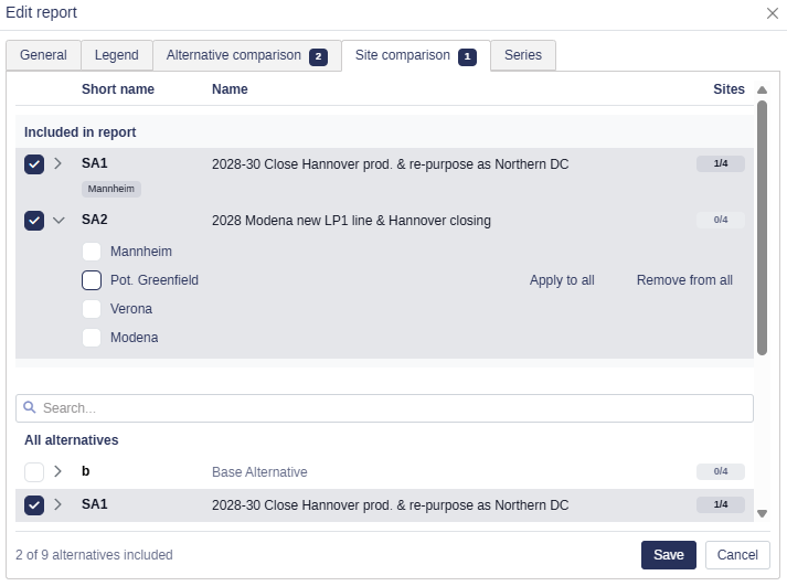
Click the alternative to expand it. Selected sites are listed first, followed by the ones not yet selected.
Tick the sites you want to include. You can expand several alternatives at the same time.
Go to the General tab and click Save.
Inclusion and site selection are two separate choices. An alternative draws curves only when it is ticked and has at least one site selected.
📌 Note: Nothing you do on the Site comparison tab changes the Alternative comparison selection. Removing an alternative there leaves its sites here untouched.
⚠️ Warning: Sites you tick on an alternative that is not included are kept while the dialog is open, but they are not saved. Include the alternative before you save, or those sites are gone when you reopen the dialog.
Reading the site selection at a glance
You do not need to expand an alternative to see what is selected inside it.
Site chips: collapsed alternatives in the tinted top list show their selected sites as chips. When every site is selected the chips collapse into a single All sites chip, and long lists are shortened with a +N more indicator.
Selection badge: each row carries a badge showing how much of the alternative is selected. Light grey means no sites, gray means some sites, and dark blue means all sites.
📌 Note: While an alternative is expanded, the chips are replaced by the site list, and the order of the sites stays fixed so the checkboxes do not move under your cursor as you tick them.
Apply a site across all alternatives
When the same site is relevant in many alternatives, you can set it everywhere in one action.
Expand any alternative on the Site comparison tab.
Find the site you want and select Apply to all to select it in every alternative, or Remove from all to clear it everywhere.
Apply to all and Remove from all change site selection only, on every alternative in the list whether it is included or not. They never change which alternatives are in the chart.
Leaving the dialog without saving
Changes on the Alternative comparison and Site comparison tabs are held as a draft until you click Save. If you try to leave while the draft differs from what is saved, Weissr asks you to confirm before discarding it.
You are asked when you:
switch to another tab inside the edit dialog,
click Cancel,
close the dialog with the close button, Esc, or a click outside it,
navigate away from the page, or refresh or close the browser tab.
Choose Discard to drop the draft and continue, or Cancel to stay in the dialog with the draft intact.
📌 Note: The General and Series tabs save as you go and hold no draft, so leaving from them never prompts.
Customising the chart display
The General tab controls how the chart itself is drawn: labels, scale, legend and font size.
Open the edit dialog and stay on the General tab.
Adjust the settings you need:
Setting | What it does |
|---|---|
Use Shortnames | Displays abbreviated alternative names to save space in the legend. |
Vertical Labels | Tilts the X axis labels vertically to improve readability. |
Y Axis Range | Sets a custom scale for the Y axis. The Auto option is recommended in most cases. |
Chart Legend Font Size | Reduces the legend font size to reclaim space in the chart area. |
X Axis Labels | Sets how frequently labels appear along the X axis. |
Legend Position | Places the legend below the chart or to its right. |
Delta Values | Turns a chosen curve into the zero baseline so differences between curves stand out. |
Click Save for the chart to update.
Customising series
A series is a single curve in the chart, usually one alternative. The Series tab gives you control over how each one appears, which matters most when the chart is going into a presentation or in front of stakeholders.
📌 Note: Changes on the Series tab are saved as you make them. This covers the custom name, colour, line style and sort order. There is no need to click Save.
Series customisation is available on line chart reports only, at every report level. Other visualization types, such as stacked bars, standard bars and tables, do not offer these options.
Set a custom name, colour and line style
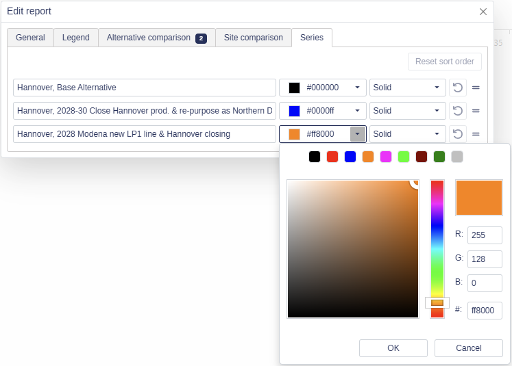
Open the edit dialog and go to the Series tab.
Set a custom name to override the alternative name shown in the legend.
Click the Color field to choose a colour for the series line.
Click the Line Style field to choose solid, dashed or another style.
Custom appearance settings are saved per chart and persist across sessions.
📌 Note: Pre-defined series such as the Base Alternative keep their default colour of black for any newly added curves, but you can still customise them manually.
Bring back the default series name
Clear the custom name field to return the series to the name it inherits from its alternative. The legend updates to the default name straight away.
📌 Note: If the same chart has been added to a Presentations folder from Reports, clearing the custom name in Reports also restores the default name on the chart in the folder.
Reorder series
By default, series follow the order of the alternative list. You can set an order that suits your analysis instead.
Open the edit dialog and go to the Series tab.
Drag and drop the series into the order you want.
To go back to the default, click Reset sort order. The series return to the order of the alternative list.
Show or hide series from the legend
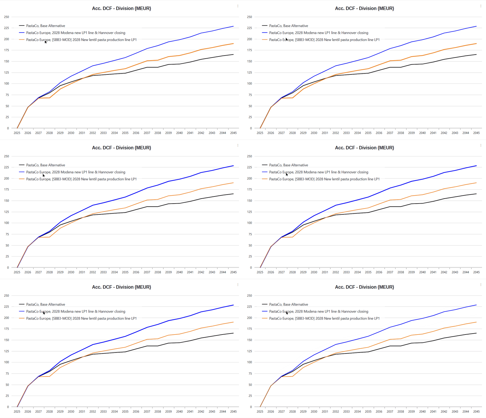
Click any series name in the chart legend to hide it temporarily. Click it again to bring it back. The chart remembers which series are hidden as you move between charts in the same context, so you do not have to hide them again each time.
Hiding and showing takes effect immediately and is saved in the background, so you can switch several series on and off in quick succession without waiting for each one. The exception is the very first toggle on a chart that has not been saved yet, where a short loading indicator appears while the chart is stored.
💡 Tip: Because the saving happens in the background, this is safe to use live in a presentation. Click through as fast as you need to.
What happens when you duplicate
When a project or a presentation folder is duplicated, all series customisations are carried over to the copy. This includes custom names, colours and line styles, the custom sort order, and which series are hidden.
📌 Note: A chart you create directly inside a Presentations folder starts as a brand new chart, with every series visible and no customisations. Only charts added to a folder from Reports arrive with the customisations they had at the time.
Showing delta values
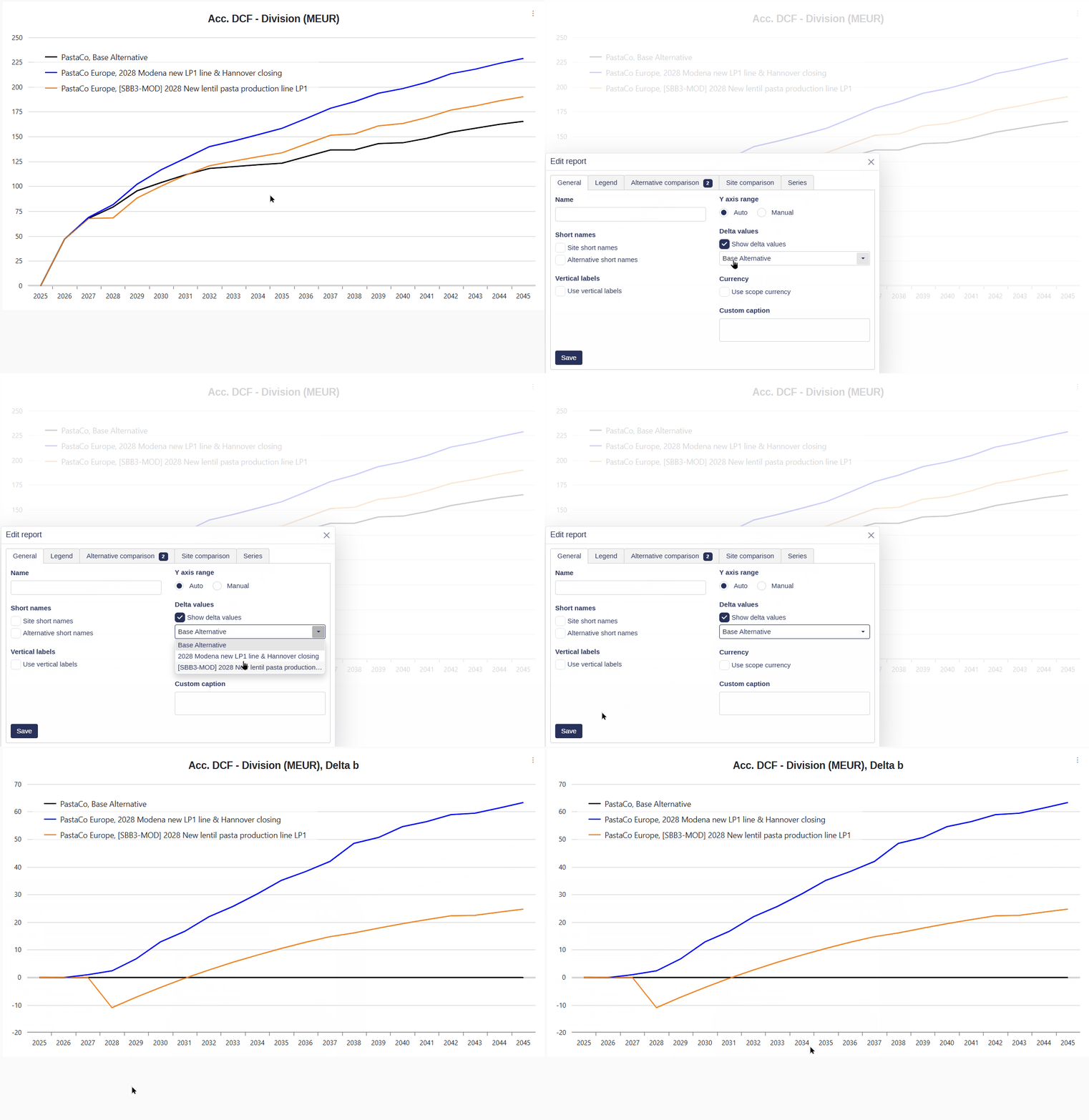
A delta curve shows how one curve behaves relative to another. The reference curve is brought down to zero, which makes the difference between alternatives much easier to read.
Open the chart so it appears in the right panel.
Click the three dots to the left of the chart report.
Select Show delta values, then choose the curve to use as the reference, for example the Base Alternative.
💡 Tip: Press D while a chart is open to apply the delta value curve, without using the three dots menu.
Adding a chart to Presentations
Presentations folders let you collect charts for viewing, sharing and export.
Open the chart so it appears in the right panel.
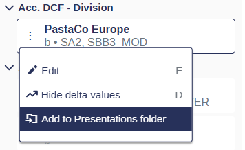
Click the three dots to the left of the chart report and select Add to Presentations folder.
Choose the folder you want to place it in.
📌 Note: Charts added to Presentations stay linked to their source chart in Reports. Any change you make in Reports is reflected in the Presentations folder automatically.
Exporting a chart as an image
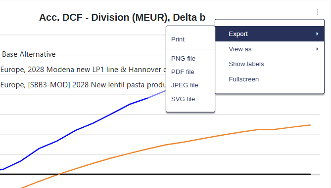
Individual charts can be printed or downloaded as image files straight from the chart grid.
Open the chart so it appears in the right panel.
Click the three dots in the top right corner of the chart grid.
Choose to Print the chart, or download it as a PNG, PDF, JPEG or SVG file.
💡 Tip: To export a whole set of charts at once, add them to a Presentations folder and export the folder as PowerPoint or ZIP.