Charts (Presentations)
The Charts tab in Presentations is where you collect, organise, and customise charts in presentation folders from for viewing, sharing and export. Charts are always linked to their source data for the alternatives, so any changes made to an alternative are reflected here automatically.
Adding charts to Presentations
Before you can work with a chart in Presentations, you need to create a folder for it.
Add a chart from Reports in an alternative
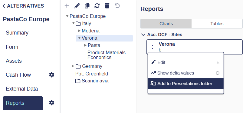
Go to Base Alternative / Strategic Building Block / Strategic Alternative and open the Reports tab, then select Charts.
Use the navigation tree on the left to browse to the entity the chart belongs to (Division > Site > Sub-industry > Category).
Click the chart in the left panel to preview it in the right panel.
Click the three dots to the left of the chart report and select Add to Presentations folder, then choose the folder you want to place it in.
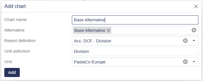
Add a chart directly within a folder
Go to Presentations and open the Charts tab.
Click the folder you want to add a chart to.
Click Add chart above the chart grid and follow the menu trail. Enter a chart name (optional) select one or multiple alternatives, select the report definition and the unit selections.
Click add to add it to your presentations folder.
Organizing folders and charts
Create a folder
Go to Presentations and open the Charts tab.
Click Create folder above the folder list on the left.
Enter a name and click Create.
Rename a folder or chart
Go to Presentations and open the Charts tab.
Click the three dots on the folder (top right corner) or on the chart (left of the description box).
Select Rename, type the new name, and press Enter.
Move a folder
Go to Presentations and open the Charts tab.
Hold and drag the folder by the three horizontal stripes in its top right corner to reposition it.
Reorder charts within a folder
Go to Presentations and open the Charts tab.
Open the folder you want to reorder.
Hold and drag a chart by the two horizontal stripes on the right side of its description box to move it up or down.
Duplicate a folder or chart
Go to Presentations and open the Charts tab.
Click the three dots on the folder or chart you want to duplicate.
Select Duplicate.
💡 Info: Duplicating a folder copies all charts it contains. Custom names, colours, line styles, sort order, and series visibility are all carried over to the copy.
Delete a folder or chart
Go to Presentations and open the Charts tab.
Click the three dots on the folder or chart you want to remove.
Select Delete.
📌 Note: Removing a chart from Presentations only removes it from this tab. The original chart remains available under Base Alternative / Strategic Building Block / Strategic Alternative > Reports.
Customising chart appearance
Add or remove curves from a chart
Each chart can display multiple curves, one per alternative or variable. You can add or remove curves to tailor the comparison shown in the chart.
Go to Presentations and open the Charts tab.
Find the chart in the left panel and click its three dots, then select Edit. You can also press E on your keyboard to open edit mode directly.
In the window that opens, the right side lists curves already added to the chart. The left side shows all available curves from your strategic alternatives.
Tick the boxes next to the curves you want to add. Untick to remove.
Go to the General tab and click Save. Wait a few seconds for the chart to update.
Customise a curve's name, colour, and line style
Each curve in a chart can be given a custom display name, colour, and line style. This is especially useful when sharing charts with stakeholders or including them in a presentation.
Go to Presentations and open the Charts tab.
Find the chart and click its three dots, then select Edit (or press E as a shortcut).
Go to the Series tab. The curves added to the chart are listed here.
Set a custom name to override the default alternative name shown in the legend.
Click the Color field to choose a custom colour for the series line.
Click the Line Style field to choose from solid, dashed, or other styles.
Go to the General tab and click Save.
📌 Note: Custom appearance settings are saved per chart and persist across sessions. Pre-defined series such as BA keep their default colour (black) for any newly added curves, but can still be customised manually.
Reorder curves in a chart
By default, curves follow the order of the alternative list. You can define a custom display order that better fits your analysis or presentation needs.
Open the chart settings via the three dots and select Edit.
Go to the Series tab.
Drag and drop the curves into your preferred order.
Go to the General tab and click Save.
Show or hide curves using the legend
You can click on any curve name in the chart legend to temporarily hide it. The chart remembers which curves are hidden as you navigate between charts, so you do not need to re-hide them each time.
💡 Info: Hidden series visibility is also preserved when you duplicate a presentation folder.
Add a delta curve
A delta curve shows how one curve behaves relative to another, bringing the reference curve down to zero so the difference between alternatives is easier to read.
Go to Presentations and open the Charts tab.
Find the chart in the left panel and click its three dots.
Select Show delta value, or select Edit, tick Show delta values, and choose which curve to use as the reference (for example, Base Alternative).
Click Save.
💡 Tip: Press D on your keyboard to quickly toggle between delta mode and normal mode without opening the edit panel.
Customise chart display settings
The chart's general display can be adjusted for clarity and readability: labels, axis range, legend position, and font size.
Go to Presentations and open the Charts tab.
Find the chart and click its three dots, then select Edit.
In the window that opens, you can adjust the following:
Use Shortnames: display abbreviated names to save space.
Vertical Labels: tilt the X-axis labels vertically to improve readability.
Y Axis Range: set a custom scale. The Auto option is recommended in most cases.
Chart Legend Font Size: reduce font size to reclaim space in the chart area.
X Axis Labels: set how frequently labels appear on the X axis.
Legend Position: place the legend below the chart or to its right.
Delta Values: turn the reference curve into the zero baseline to emphasise the comparison between curves.
Click Save and wait a few seconds for the chart to update.
Exporting charts
Export a single chart
You can export individual charts as image files or send them to print directly from the chart grid.
Go to Presentations and open the Charts tab.
Open the folder containing the chart you want to export.
Click the three dots in the top right corner of the chart grid.
Choose to Print the chart, or download it as a PNG, PDF, JPEG, or SVG file.
Export a folder
You can export an entire chart folder at once as a PowerPoint presentation or as a ZIP archive containing all charts. This is useful when you want to share a full set of charts with stakeholders outside of Weissr.
Go to Presentations and open the Charts tab.
Open the folder you want to export.
Click Export and select your preferred format: PowerPoint or ZIP.
💡 Info: Folder exports are processed in the background. Once ready, you can find and download them under Exported reports in the left navigation menu.