Configuring Reports
The Reports settings control the charts and tables that Weissr users see for each strategic building block (SBB) and each alternative (BA and SAs). Reports are auto-generated from the cash flow model in a predefined order, and everything about them is configured in the Administration console. This guide is for administrators setting up reports for a project.
Where do you set up reports?
Location: Administration → Capex Strategy → Project → Reports
Every report you create here becomes available to users on the Reports tab of the alternatives in that project. Users cannot create reports themselves, so any chart or table they need has to be defined here first.
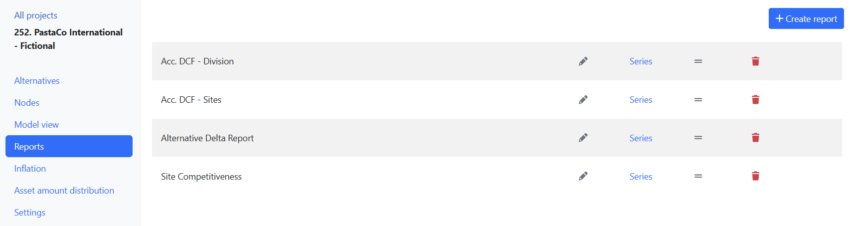
Setting up a new report
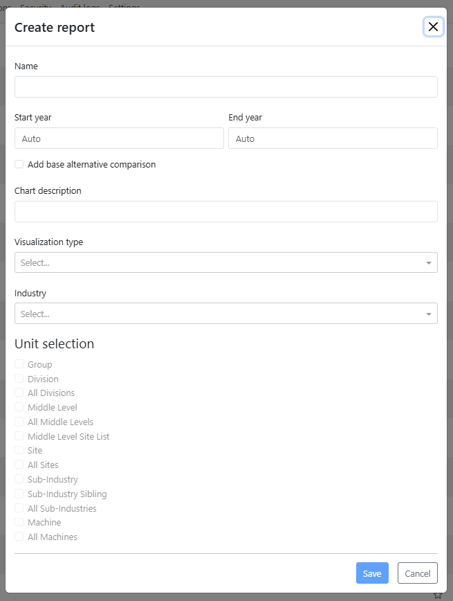
Click the + Create report button in the top-right corner.
Name: Enter a name for the report.
Time horizon: Assign a start year and an end year.
The reporting period for each report type is defined by its start and end years. Some report types, such as the bar chart that compares historical and future values, use predefined time periods:Periods 1 and 2 represent historical data
Periods 3 and 4 represent future data
Visualization type: Select the report type from the available options:
Alternative delta
Line chart report
Materials table
Stacked bars %, average annual values historical vs future (2 stacked bars)
Stacked bars, annual average values
Stacked historical vs. future
Standard bars, average annual historical vs future values
Table: nodes, time
Table: variables, nodes
Table: variables, time
Industry: Select the model sheets to retrieve data from. You may also choose Not Selected if no specific sheet is needed.
Unit selection:
Reports can be generated at different levels of the asset tree, from the top level (scope) down to the sub-industry level.By selecting a node in the asset tree, the report will include data for that node and its underlying structure. If you select the scope level, all chart-based reports will be listed. If you select a sub-industry node, only related reports will be shown.
Click Save to create the report.
Add data to your report: Click on the Series button. See highlighted blue area below.
Choose the model rows that you want to include as data for your selected report type. See highlighted blue area below.
Press Save.
💡 User impact: The visualization type you pick decides how much users can adjust the report afterwards. Only Line chart report supports series customisation, so users can rename, recolour, restyle, reorder and hide individual curves there. Bar, stacked bar and table reports are shown as configured.
Ordering of reports
To change the order of your reports, simply drag and drop them into the desired sequence.
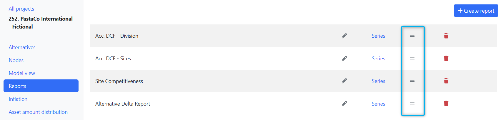
💡 User impact: The sequence you set here is the order users see the reports in on the Reports tab, so put the reports that carry the story first.
What can users do with a report once you have created it?
A report definition sets the variables, the time horizon and the visualization type. Everything after that is in the user's hands, and it is worth knowing what they can change so you can tell where a configuration question ends and a usage question begins.
Choose what the chart compares: users select which alternatives, and which sites within those alternatives, appear as curves. The report definition does not fix this.
Adjust the display: short names, vertical labels, Y axis range, legend position and font size, and X axis label frequency.
Customise the series: on line chart reports, users can set a custom name, colour and line style per curve, reorder the curves, and hide curves from the legend. These settings are saved per chart and survive duplication of a project or a Presentations folder.
Show delta values: users can bring any curve down to zero as a baseline so the differences between alternatives stand out.
Collect and export: charts can be added to a Presentations folder, exported individually as PNG, PDF, JPEG or SVG, or exported as a whole folder to PowerPoint or ZIP.
📌 Note: User customisations never change the report definition. If a user renames a series or hides a curve, other users' charts and your configuration here are unaffected.
👉 Charts covers all of this in detail, including the edit dialog, series customisation and export options.
Related topics
👉 Charts