How to customize a curve (Presentations)
You would like to customize a curve (color, line style) in a specific graph, here’s how
Make sure to be in the Presentations → Charts tab.
Find the chart you want to add a curve to by clicking on the right folder in the left panel.
Once you found the right chart in the right folder, click on it in the middle panel of the window to make it appear in the right panel.
Once you can see the chart, click on the three dots located on the left of the chart report. Then click Edit.
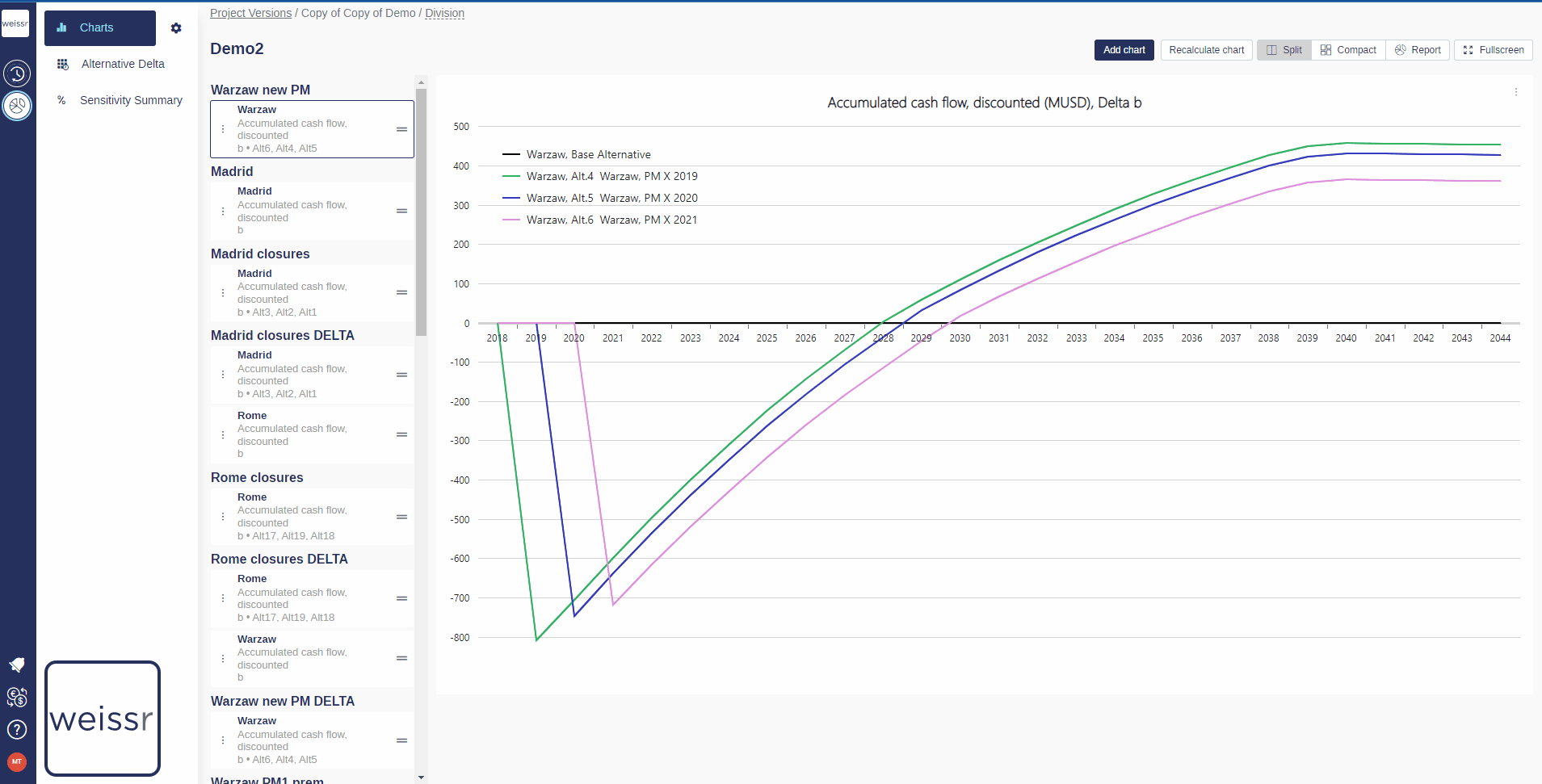
In the window that opens, in the Series tab, you should see listed the curve(s) you would like to customize (if you wish to add another curve on that chart, see this article first).
Click in the box in the Color column to choose a color, and click on the cell in the Line Style column to open the dropdown menu in which you can choose from different styles for the line of the curves.
Once you are satisfied with your choice, go to General tab and click on Save to validate your choice and wait a few seconds for the chart to update.
If the changes do not appear after 10 seconds, try again.
You can only customize curves that are added to the original chart (+1), the original curve has a fixed format.