How to customize a graph (Presentations)
You would like to customize a graph (legend, axis, labels, range, font size..), here’s how
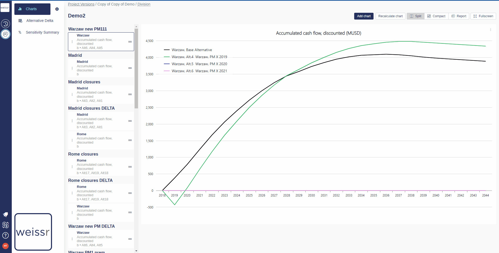
Make sure to be in the Presentations → Charts tab.
Select a folder in which the chart is located.
Once you found the right chart in the right folder, click on it in the left panel to make it appear in the right panel.
Once you can see the chart, click on the three dots located to the left on the graph desciption box in the left panel.
In the window that opens, you can :
choose to Use Shortnames instead of long ones to gain space by ticking the corresponding boxes.
tilt the X-axis labels to Vertical Labels to gain space and/or readability.
define the Y Axis Range to change the scale (the Auto option is recommended).
change the Chart Legend Font Size to gain more space.
define the frequency to which X Axis Labels show up, depending on preferences.
choose the Legend Position between under the chart or on its right.
turn the original curve to a delta curve (brought down to 0) to show Delta Values instead, to emphasize the comparison between curves (see this article for another way to do so).
Once you are satisfied with your choice, click on Save to validate your choice and wait a few seconds for the chart to update.
If the changes do not appear after 10 seconds, try again.